[정답과 달라도, 화면만 만들어내면 되니깐 이론만 보고 풀자]
<연습문제 1>
|
1
2
3
4
5
6
7
8
9
10
11
12
13
14
15
16
17
18
19
20
21
22
23
24
25
26
27
28
29
30
|
<!DOCTYPE html>
<html lang="en">
<head>
<meta charset="UTF-8">
<meta http-equiv="X-UA-Compatible" content="IE=edge">
<meta name="viewport" content="width=device-width, initial-scale=1.0">
<title>Document</title>
<style>
.title {
color: brown;
font-size: large;
font-weight: 800;
}
p{
margin-left: 50px;
font-weight: 200;
font-size: smaller;
}
</style>
</head>
<body>
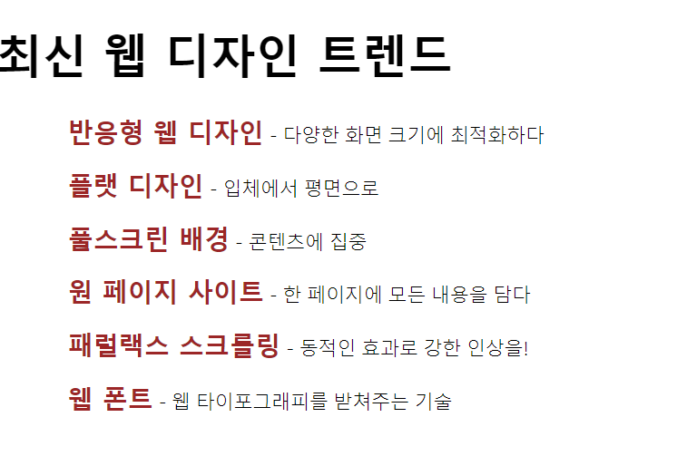
<h1>최신 웹 디자인 트렌드</h1>
<p><label class="title">반응형 웹 디자인</label> - 다양한 화면 크기에 최적화하다</p>
<p><label class="title">플랫 디자인</label> - 입체에서 평면으로</p>
<p><label class="title">풀스크린 배경</label> - 콘텐츠에 집중</p>
<p><label class="title">원 페이지 사이트</label> - 한 페이지에 모든 내용을 담다</p>
<p><label class="title">패럴랙스 스크롤링</label> - 동적인 효과로 강한 인상을!</p>
<p><label class="title">웹 폰트</label> - 웹 타이포그래피를 받쳐주는 기술</p>
</body>
</html>
|
cs |
<연습문제 2>

|
1
2
3
4
5
6
7
8
9
10
11
12
13
14
15
16
17
18
19
20
21
22
23
24
25
26
27
28
|
<!DOCTYPE html>
<html lang="en">
<head>
<meta charset="UTF-8">
<meta http-equiv="X-UA-Compatible" content="IE=edge">
<meta name="viewport" content="width=device-width, initial-scale=1.0">
<title>Document</title>
<style>
#container{
width: 150px;
height: 40px;
background-color: rgb(72, 71, 71);
}
p{
color: aliceblue;
text-align: center;
line-height: 40px;
font-weight: 600;
text-shadow: 2px 0.1px black;
}
</style>
</head>
<body>
<div id="container">
<p>웹 개발 기초</p>
</div>
</body>
</html>
|
cs |
보충:
text-shadow 가로축 길이 세로축 길이 blur(흐릿함 기능) color;
line-height를 통해 block 안의 글자의 높이가 정 가운데에 오게 맞춤
<연습문제 3>
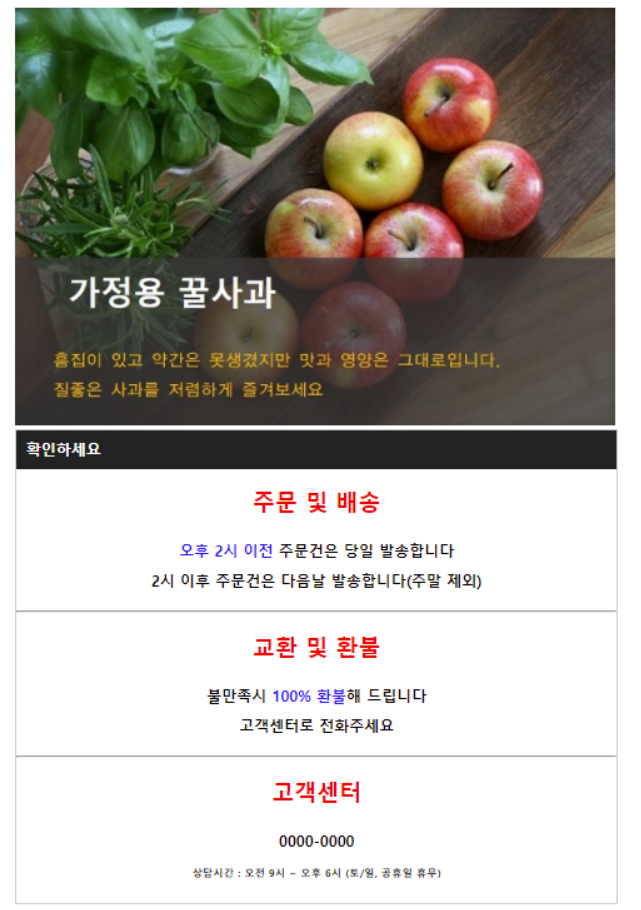
기존문제

내가 만든 결과(처음에 '가정용 꿀사과'를 block에 넣고 opacity로 투명도를 조절했으나 너무 글시가 희미해져서
새롭게 position을 통한 글자와 block을 겹쳤다. 그래서 조금 덜 희미해진것.)
|
1
2
3
4
5
6
7
8
9
10
11
12
13
14
15
16
17
18
19
20
21
22
23
24
25
26
27
28
29
30
31
32
33
34
35
36
37
38
39
40
41
42
43
44
45
46
47
48
49
50
51
52
53
54
55
56
57
58
59
60
61
62
63
64
65
66
67
68
69
70
71
72
73
74
75
76
77
78
79
80
81
82
83
84
85
86
87
88
89
90
91
92
93
94
95
|
<!DOCTYPE html>
<html lang="en">
<head>
<meta charset="UTF-8">
<meta http-equiv="X-UA-Compatible" content="IE=edge">
<meta name="viewport" content="width=device-width, initial-scale=1.0">
<title>Document</title>
<style>
fieldset{
padding: 0%;
height: 250px;
width: 400px;
background-image: url(./flower.webp);
background-size: cover;
/* 부모에 relativ. 겹칠 두 자식에는 position absoulte 추가 */
position: relative;
}
.black{
margin: 150px 0px 0px 0px;
height: 100px;
width: 400px;
background-color: rgb(87, 86, 86);
opacity: 0.5;
position: absolute; /*겹칠 대상1*/
}
.title{
color: white;
margin: 40px 30px;
font-weight: bold;
opacity: none;
font-size: large;
}
section{
margin: 2px 0px 0px 3px;
width: 403px;
background-color: black;
color: white;
font-size: small;
}
.div1{
border: 1px solid black;
width: 401px;
margin: 0px 3px;
}
.p1{
text-align: center;
font-weight: bold;
padding: 7px 0px 0px 0px;
color: red;
margin: 0px;
font-size: large;
}
label{
color: blue;
}
p{
text-align: center;
font-size: small;
font-weight: bold;
}
</style>
</head>
<body>
<fieldset>
/*겹칠 대상2*/ <div style="margin: 150px 0px 0px 0px; position: absolute;">
<span class="title">가정용 꿀사과</span>
<p style="font-size: small; color: gold; text-align: left; margin: 15px 20px;">
흠집이 있고 약간은 못생겼지만 맛과 영양은 그대로 입니다.<br>
질 좋은 사과를 저렴하게 즐겨보세요
</p>
</div>
<div class="black"></div>
</fieldset>
<section>
<span style="margin: 2px 5px;">확인하세요</span>
</section>
<div class="div1">
<p class="p1">주문 및 배송</p>
<p><label>오후 2시 이전</label> 주문건은 당일 발송합니다.<br>
2시 이후 주문건은 다음날 발송합니다(주말 제외)
</p>
</div>
<div class="div1">
<p class="p1">교환 및 환불</p>
<p>불만족시<label> 100% 환불</label>해 드립니다.<br>
고객센터로 전화주세요
</p>
</div>
<div class="div1">
<p class="p1">고객센터</p>
<p>0000-0000</p>
<p style="font-size: x-small;">상담시간: 오전 9시 ~ 오후 6시 (토/일 공휴일 휴무)</p>
</div>
</body>
</html>
|
/*겹칠 대상1*/cs |
<보충>
style에서 .black의 absolute 를 제거하고 .black과 .title에 relative와 z-index를 사용하여 수정하였다.

|
1
2
3
4
5
6
7
8
9
10
11
12
13
14
15
16
17
18
19
20
21
22
23
24
25
26
|
<style>
fieldset{
padding: 0%;
height: 250px;
width: 400px;
background-image: url(./flower.webp);
background-size: cover;
/* 부모에 relativ. 겹칠 두 자식에는 position absoulte 추가 */
}
.black{
margin: 130px 0px 0px 0px;
height: 100px;
width: 400px;
background-color: rgb(87, 86, 86);
opacity: 0.5;
position: relative; /*겹칠 대상1*/
}
.title{ /*겹칠 대상2*/
color: rgb(249, 243, 243);
margin: 40px 30px;
font-weight: bold;
position: relative;
font-size: large;
z-index: 10;
}
|
cs |
'📚HTML, CSS > 실습 및 프로젝트' 카테고리의 다른 글
| html / css 프로젝트 1-(1) (0) | 2023.01.30 |
|---|---|
| [html, css] 기초 or 기본 문제들 모음(3)(+유효성 검사) (0) | 2023.01.30 |
| [html, css] 기초 or 기본 문제들 모음(2) (1) | 2023.01.27 |
| [html, css] 기초 or 기본 문제들 모음 (0) | 2023.01.26 |
| form 관련문제 (0) | 2023.01.17 |